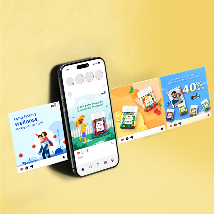
Makson Group came during a time of immense change. The pandemic had shifted how everyone looked at their health, creating a collective realisation to focus on well-being. The brief was to develop nomenclature, brandmark, packaging, design, communication, and market strategy for a new brand of health gummies, applied across everything from website to social media to e-commerce.
A Sanskrit prefix for the self.
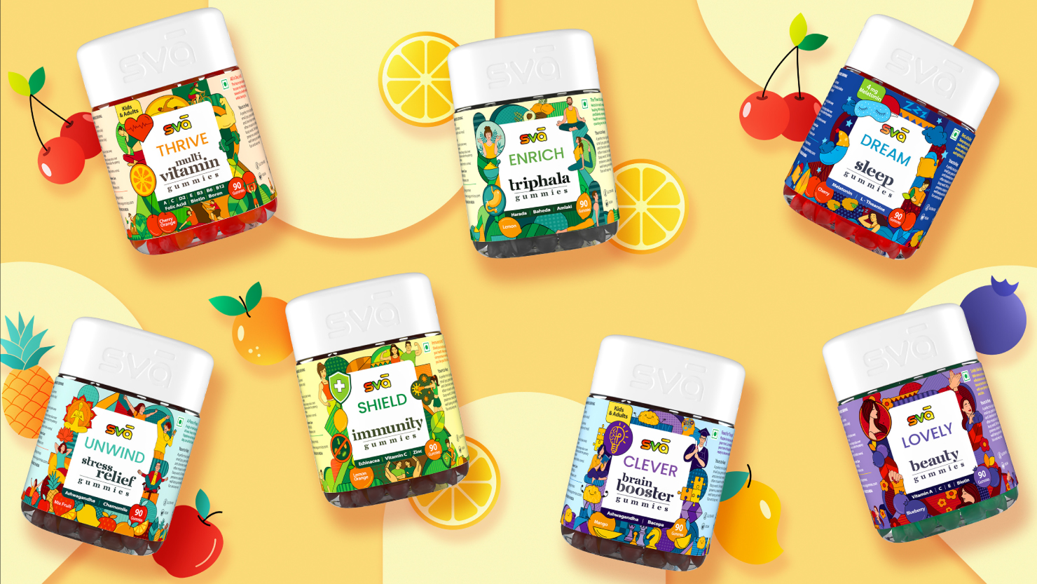
Peace, as it turns out, lies within. Sva is a Sanskrit prefix for the self, addressing the inner lives of customers and reminding them that their happiness is tied to their health. The brandmark uses various shades of green, yellow, and orange, with vibrant colours representing the fun side of the brand while the nomenclature holds its maturity.
A fresh visual identity was built with an innovative approach to packaging. Human vectors with distinct characteristics, shapes, patterns, and font styles were incorporated to resonate with each product's properties. An arched window, inspired by the shape of the gummies themselves, became a core design asset that extended cohesively across brand and product communication.
Wellness is yours to keep.
With 7 different gummy products for kids and adults, SVA was positioned not as a solution to health problems, but as a partner that walks the journey of life with the consumer. A brand that is yours to keep.